

Your landing page needs help. A lot of it. Badly.
No, stop — don’t run away. It’s not personal. Pretty much all landing pages suck, and they suck in predictable ways. (Yes, even mine.) You are far, far from alone.
Landing pages are typically the most neglected of all the parts in the marketing engine.
Despite the very clear, cold, hard facts that…
- Landing pages are the face of your product
- Landing pages are often the first exposure potential buyers have to your product
- Landing pages are the last thing buyers see before they convert (and, if they fail to convert, the last thing they see, period)
It doesn’t matter what you’re selling — be it SaaS, an Ebook, a course, a webinar, or even a freebie designed to snare signups (historically called a “squeeze” page)…
Your landing page does so much heavy lifting in your business.
But — let’s get real — it’s weak and puny and probably a template you threw up a while ago without a lot of thought, and it is kinda lame but it’s kinda working, right, so why mess with a good thing? And the copy? Oh the copy. Urgh. Let’s not talk about the copy. Or the big picture design.
Wouldn’t it be nicer to talk about micro-optimizing a headline or a call to action button color instead?
It sure would! And it’d also be a simpler thing to write about, to be quite frank. There are lots of articles out there on that stuff. Because it is both alluring and easy.
Empires aren’t built out of alluring and easy, though, or everyone would do it.
You’re here because you want to get a drastically different result. That means we need to talk about making drastic changes.
We need to talk about the BIG problems with your landing page: The overall design, layout, and the copy as a whole.
And that’s gonna take a big article.
So buckle up, it’s gonna be a bumpy ride.
Before we start, a quick note about my bonafides:
Hi, I’m Amy. I’m a designer, developer, writer, and teacher. I’ve been in business online since 1998. I’ve sold close to $8 million of dollars’ worth of product with landing pages I have designed and written exclusively by myself, and I’ve helped my students, clients and friends learn to do the same and sell many millions more. The types of products have encompassed everything from live workshops, to online courses, Software as a Service, physical books, digital books, consulting services, productized consulting, subscription membership programs, etc etc ad nauseum — for every type of customer (yes, including the famously reluctant developers).
And a couple quick answers to a question or two I know you’re asking:
Q: Does this advice apply to my product?
Absolutely!
It makes little difference what you’re selling because you. are. selling. The act of selling is the same because the act of buying is the same, because it’s a psychological dance that happens between two people and is governed by the laws of psychology and economics.
Q: Does this advice apply to my customer? They’re cranky/naïve/hate sales-y stuff.
Yes it does!
I’ve made a career out of selling to audiences who allegedly are too suspicious or tight-fisted to buy (developers). Your audience may prefer to hear things phrased in different ways and prefer different forms of persuasion and proof, but their attitudes can’t change the structure of the selling interaction itself.
No matter what type of buyer they are, they’re still human.
Humans invented commerce, well before we invented money. Trade is what we do.
Everybody buys.
In 1905, a then-little-known copywriter named John E. Kennedy defined advertising as “salesmanship in print.” He died one of the world’s most successful, famous, and respected advertising men of all time.
Your landing page is sabotaging your sales process.
No, I don’t know you — but I can just about guarantee it.
Here are six HUGE mistakes that I see on landing pages, absolutely everywhere online, from newbies to gurus to multi-million-dollar companies who really ought to be able to know (or hire) better:
- Focusing on the product and not the reader
- Leaning too heavily on features and benefits
- The wrong kinds of vivid supporting details
- Not enough vivid, supporting details
- Making it physically difficult to read
- Me-too design and copy
Again, these apply to every type of landing page. It doesn’t matter what you’re selling, including whether that thing you’re selling is free.
So let’s dig into these. Starting with #6.
#6: Me-too design and copy
This is the largest mistake I actually see in the sense that when it happens, it encompasses the entire sales page, and also the most common because it happens a whole heckuva lot… but in many ways, it’s also probably one of the least painful errors because it is the least likely to immediately destroy your sales.
It’s a constant, annoying hum — a background noise — not a screech of impending doom.
That’s why it’s at the bottom of the list.
But! It’s still important! Because…
The landing page is the face of your product.
It’s the first thing that people see when they’re seriously starting to think about maybe buying something, anything, not necessarily your product, but perhaps your ideas or your approach or even just you, as a person.
And when you talk to people, or hand out a business card, or send someone a link, or write a bio — it’s the place you direct people.
And if you pay for ads, a landing page is wherever folks land when they click.
When you’re doing a launch and someone reads an email that finally makes them interested enough to click a link, that’s where they end up.
The landing page is the face of your product. I can’t repeat myself enough.
When your potential customer looks at your landing page then gets a phone call, or has to go to a meeting, or their dog barfs in the other room, and they get distracted and come back an hour later or the next day and they’re thinking, “What was that thing I wanted to buy? I think I’ve decided to buy it now. Where was it?” And they start looking through their tabs… Your landing page is the mental picture they’re scanning for.
So imagine, for a moment, the devastation if your landing page looks like every other landing page for products in your category.
It’s not good, folks.
Your landing page should look different from other products. It should read differently as well.
Take a look at these me-too landing pages:
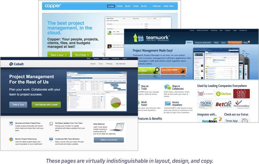
They’re virtually indistinguishable!
They have nearly identical layouts and design. They have a similar color palette. They use the same talking points. They list the same features, the same types of benefits. Get your team all on one page! Manage files and comments!
They even have the same two buttons in the “hero” block: Take a Tour (left), Try for Free (right).
There’s effectively zero distinction between these products in design or copy, so how would the user know which one that they should actually invest the time to try out — much less pay good money for?
Me-too landing pages happen when you:
- use templates
- inadvertently parrot the things you’ve seen and read, and
- implement “industry standards”
Standards and commonalities are great when it comes to making people comfortable. But your product isn’t an interchangeable widget, and your job isn’t to get people to relax and nod off.
Your job is to excite people to take action.
When your page is too comforting and standardized, your product can’t stand out — not as worse, sure, but certainly also not as better, or even new. And samey-same things aren’t memorable. Or enticing.
If your me-too landing page is still performing okay, it only means that you’re snagging some customers before the competition does. (Or perhaps they hate their current solution so much, they’ll try anything; or perhaps they’re coming via effusive word of mouth.) That’s great! You’re semi-failing your way to success, which is a time-honored way to run a business.
But you can do better. Your product deserves it.
And it’s super, super embarrassing when someone accidentally buys the wrong product because they can’t tell them apart.
How do you fix me-too? Well, for starters, don’t use a landing page template. Don’t simply copy what everyone else is doing. Don’t rely on your “instincts” — because your gut will serve up regurgitated garbage. Ruthlessly examine what you design and write for tropes that come automatically from exposure to other people’s work.
But really, the me-too problem is the culmination of all the other problems in this list — so if you solve the other five, you’ll solve this one automagically.
Bottom line though:
You want to sell something different? Make it look and sound different.
But don’t fall prey to mistake #5…
#5: Making it physically hard to read
Subtweet: Design trends.
Now I just got done telling you you don’t want your pages to look like everybody else’s pages, right? So now you’re thinking you probably want to jazz things up, maybe make things fly and animate as you scroll, or break up your content into cool multi-colored blocks, or maybe you’ll take the easier route and spice things up with some zany graphics, like people dancing with abstract colors and shapes.
There’s just one problem: looking cool doesn’t do The Job.
A man cannot serve two masters, and a piece of design and copy cannot do two jobs. Your landing page has one job: Sell. your. product. To persuade folks to hand over their information — maybe even their credit card — to invest time, energy, money in buying whatever you’re selling.
You need to persuade people that it’s worth their time, energy, money, and the risk they take that it will all be for naught. (Really: In the days of free trials and refunds, most buyers hate wasting time more than money.)
And there’s just really just one tool you can use to persuade them… and you really don’t want to know what the engagement metrics are on landing page videos.
Your copy. That’s the best tool you’ve got.
Which means… you really need them to read.
Landing page design is actually a usability exercise.
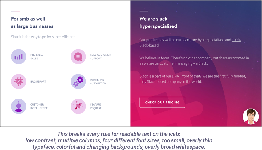
And for more than 20 years, we’ve known what makes content readable: One column, good spacing, strong contrast, aligned left and ragged right, and good, clear typographical hierarchy; as little to distract the eye as possible.
And yet, most design trends have you putting visual roadblocks in the copy:
- the “different sections are different colors” design
- the “gradients… with text on them” design
- the “multiple columns with graphics” design
- the “content on the left, next bit of content on the right, now reverse!” design
- the “stuff flying in and out, look at me, I’m a bird!! don’t look at that boring static text!” design
If you’re breaking the copy up into seemingly discrete chunks, if you’re changing the background and text color, altering the left edge of the copy, and changing the fonts, and making stuff slide around…
You’re literally making it physically more difficult for your audience to read the copy.
And so… people who are lazy, or busy, or distracted, or not as invested, or not as fluent at reading as you think will just give up.
I’m a designer. I like trends. I like things that are pretty and shiny; I describe my personal aesthetic as Champagne Lisa Frank, and I’m not mad about it.
But as much as I love cool design, motion graphics, and custom illustrations… I’m not willing to let a cool design to get in the way of actually selling my product. And neither should you.
The best landing page is one where all of the text has the same left alignment in a single column, with same color text on the same color background.
And all graphics should either
- demonstrate the visitor’s problems and successes with the product itself, or
- support the copy, not distract from it.
Is your “copy” actually a video or animated illustration of the product at work? Same rules apply!
Whatever your “copy” may be, that thing is the most precious thing, you must make it so easy to see and use it’s almost impossible not to.
It should be the biggest thing, the most centered thing, sharing space with nothing — and painfully obviously readable or clickable, no competing glitter, no distractions, no nothin’!
I know this sounds silly. “Do you really think that people aren’t able to tell that the copy keeps going, even though the background color changes?” Of course they’re able to, but will they bother? Decades of usability research says no. People give a web page very, very little time to make it worth their while before they hit the back button.
#4: Not enough vivid details
So: The landing page is the face of your product. And the job of that face is to sell your product.
Would you buy a software from a blank-faced, eye-less, talking mannequin?? Nooooooo, but you’d get nightmares for free!
Why? Because there’s something creepy as hell about a thing that appears to be human but has none of the facial features that let us “read” them. That’s the Uncanny Valley in a nutshell.
We can’t trust what we can’t get a grip on.
And, no brainer, it takes trust to open wallets (rather than run screaming for the hills).
But less obvious is the need to build trust at every step, not just the final payment form:
- I trust you to make this interesting enough for me to spend 5 minutes reading
- I trust you to respect my inbox when I fork over my address
- I trust that this free trial / free sample will be useful enough to open it and try it out and give it a chance
Without trust, you may only think you converted someone. You may convince them to sign up, but that doesn’t mean you’ve convinced them to invest the time to try out the product, become a convert, and spread the word.
There are a lot of hacks out there for “injecting trust” into your landinag pages:
- badges
- testimonials, social proof
- logos
But there’s another one that works even without the other three, so it works for pre-sales as well as existing products. And it’s one you rarely see talked about. Which you’ve probably guessed by now. (It’s not eyeballs, c’mon.)
That ingredient is specific, concrete, and vivid details. What I call “crispy” details, á la habits researcher BJ Fogg.
Think of crispiness like the facial features of your landing page. And like all six problems, this one is hopelessly intertwined with the others.
Think back to the project management landing page apps I showed earlier: “Get your team all on one page”, “manage files and comments.” These phrases sound like they’re saying something specific, don’t they? But what do they really mean? Can you imagine the app, clear as a bell? Do they paint a clear picture of what you do, what you get, how it works, what it does for you?
If you can’t picture something in your mind, why would you buy it?
Come with me on another little thought experiment: Imagine you’re at the store. The grocery store. In fact, you’re standing in the meat section, staring down past that little glass rim into the cooler. At a white paper box labeled MEAT.
Do you want to buy it?
No? Let’s upgrade the sales copy: The white box says STEAK.
Do you want to buy it now?
What if it says RIBEYE STEAK?
What if it says USDA PRIME GRADE GRASS-FED RIBEYE STEAK? On that white, opaque box. Taped shut.
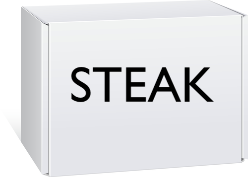
Are you going to say to yourself, “Self: Well, I want a steak, so I’m gonna buy that steak in a box.”
Isn’t it just a little bit… creepy? Less creepy than talking mannequins, but… still…? Yeahhhh. No thanks.
In real life, grocery stores sell you steak by showing it to you. Steaks are in clear packaging so you can see the exact steak you want to buy — size, color, shape, marbling, and all. You don’t have to exert any effort to imagine it. You can spend all your energy imagining how good it’s going to be when you’re done with it.
Vegetarians: You, no doubt, enjoy touching and picking out your produce by hand, and there’s no amount of great copy or visuals that will sell you a steak, which is another persuasion principle to think about!
Your landing page must do the same job for your product using words, screenshots, GIFs, interactive bits, and/or video.
The right mix of formats will depend on your audience (a great thing to split-test!), but one thing is universally true: The more specific, vivid, and concrete, the better.
The more details, the better the customer can imagine themselves using it, the less effort it will take for them to do so, the more energy they’ll have left over to open up their wallet and try it out.
Remember: My short-hand for the idea of “specific, vivid, and concrete” detail is crispy. Not smooth and featureless, soggy, squishy, or bland.
Banish mushy, meaningless verbs like “manage” and smooth, featureless nouns like “files” and “tasks.” Use active verbs, describe what happens, and use the most specific nouns you can find.
Don’t give your visitors a white STEAK box. Show them the steak.
And if you can’t show them the steak, give them the clearest word-picture of the steak possible. Tell them every damn thing about the steak, how it looks, how it’s marbled, and the farm it came from and how that cow was raised and how it will cook up, and taste, and how much their family will love it.
#3: The wrong type of vivid details
Phew. Okay: You’re sold on having enough details, because those concrete, very specific images build interest and produce trust. But not every kind of vivid, specific, and concrete detail will do. Mr Potato Head features and/or a word cloud about warm summer days on the dairy farm will not move product.
In my class, 30x500, I teach my students how to go from nothing to a profitable product launch. Of course, this includes several lessons on writing sales copy — and of my big rules is Lead with the customer’s pain.
Nothing is more persuasive than a person’s own experience.
My lessons say, “Describe the user’s pain experience as if you were writing a movie script.” Not unlike the little steak story I told you earlier.
And so, at first, everyone writes things like:
The morning light slots through your home office window! Birds are chirping, your cat is bumping your shin for her morning can o’ tuna, your radio is tuned to NPR.
Are these details vivid, specific, and concrete? Crispy, you might say? Yessireebob.
But…
They’ve got zip to do with whatever product is coming.
The copy is doing a job all right, but not the job it was hired to do.
It’s just so tempting to amp up your copy with little emotional details like that, your reader is pacing, or tearing out their hair, or stirring their coffee while they do some tedious task, etc., etc. But unless you’re literally selling some sort of anti-hair-tearing, pro-coffee-stirring product, these details can only serve to turn off readers. What if they’re not tearing out their hair or stirring their coffee? What if, in fact, they’re bald and drink only milk? You just lost them. Over nothing! You threw in some meaningless pizazz and they looked around and said, “Zazz? I haven’t heard that name in years.” Bam, Back button.
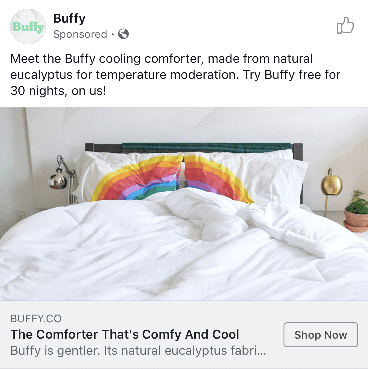
The wrong kind of crispy: This advertisement for a blanket is eye-catching, but the comments under the ad are filled with questions of, “…but where can I buy those rainbow pillowcases?!”
Vivid detail has a job, too: Connect with your reader.
Because vivid detail exists to empower your landing page to do its job, which is — again — to sell your product.
And thus, every crispy detail must earn its place on your page by relating to either:
- the reader’s problem, or
- the product you’re selling
When every detail does its duty, each one forms a link in a sturdy chain that stretches between your reader’s experience and their future with your product.
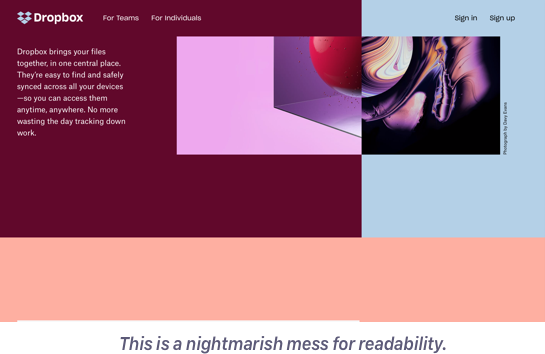
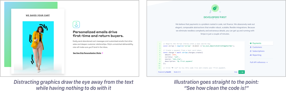
Don’t forget: This advice covers design details, too. Graphics need to do their job. (If you’ve been puzzled or put off by the high-profile redesigns of Dropbox or Drip lately, with their weird unrelated illustrations of people dancing with random shapes and changing colors, this is why.)
#2: Leaning too heavily on features and benefits
Subtweet: Copywriting tropes.
Speaking of chains, let’s talk about stuff that “everybody knows” — advice that gets passed from generation to generation without question.
Here’s an old copywriting rule that will never die:
Don’t talk about features, talk about benefits.
What’s a feature? A thing that the product has, such as a number of chapters, a video on xyz topic, or a file upload function.
What’s a benefit? A thing that the product delivers. To, you know, the buyer. Such as a skill they will learn, or “manage files with ease!”
Here’s the thing:
We’ve established that your visitor is one milisecond of frustration away from blowing up the Back button bomb.
You know, now, that making your visitor do work to read is a losing proposition (they are gonna give up).
And you know that the crispier and more concrete the details you can add, the better (because you’ll grab ‘em by the frontal cortex).
When you combine I Hate to Work To Learn Stuff + Love Crispy Concrete Details, what you get is a loathing of abstraction. Abstraction is hard, y’all. Abstract thinking is hard. It’s not that your reader is incapable — far from it! — but that it takes effort, and you haven’t yet proven you’re worth the effort that abstract thinking requires.
Yet abstract thinking is exactly what a list of features or benefits demand.
Think about it:
You say, This app has a file feature! This book has 26 chapters!
The customer then has to do the mental work of figuring out,
Well, do I need this file feature? Is that better than using Dropbox or email? Will I get my team to use it reliably or will it just cause more backlog? Oh. There’s 26 chapters. Do I have 26 problems? It comes with three videos. Is that good? Or is six hours of recorded content too much? Am I really gonna watch that? Do I have to?
Again: your potential buyers are busy, lazy, distracted, and so on, and unwilling to spend effort without a clear reward at the end. And if they don’t expend the effort, they will never see the benefit of your product, and that means they won’t buy. So it’s in your interest to do the thinking for them.
Benefits-speke is supposed to do the work for you…
FEATURE: File management
BENEFIT: Manage files with ease!
FEATURE: 26 chapters
BENEFIT: Learn the complete process, beginning to end
But there’s a catch…
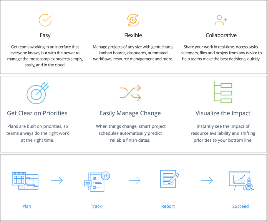
Looking back at our dead-horse, me-too PM apps, they don’t say: We have a files section. We have a comments section. Those are features speak. They instead say things like, Manage files and comments with ease! Plan, track, report! Collaborate!
Those are, in fact, benefits.
Gasp! The bad examples follow the rules!
(More like bane-efit, amirite?!)
Of course, you could improve this copy by getting crispy: No more clicking around, manage all your project’s important design revisions from one page. That’s a benefit and it’s specific and it’s concrete, but it still isn’t awesome.
Why?
There’s still a step that the reader has to take. There’s still a gap they have to cross. They have to pause to ask themselves,
Do I click around a lot right now? Is that a problem?
You’re still leaving the work to the reader — and whenever you try to make your reader work, you’re going to lose a significant number of them.
Here’s a fact: We’re not all walking around thinking about our problems 24 hours a day. It may seem that way on Twitter, but we’re not, not really, and you can tell because we’re reading listicles on the internet instead of huddled in a corner screaming in a puddle of our own effluent.
To survive as humans, we’ve gotta tune that pain out.
And yet to make a sale, you’ve gotta bring it back up. Much like sanding wood to take paint, you’ve got to prepare the reader for your benefit:
You search through email after email, hunting the little paperclip icon that hides the last workable design revision. It was last week, right? Oh wait, was it even in an email? Or was it in Slack? Or did the designer text it to you? It’s on your phone, isn’t it. Of course it is. Now you have to text it to yourself. Good grief.
Why can you never find exactly the right file when you need it?
That’s pain copy.
The right reader will be ripe & ready to hear about some benefits now, please and thank you… and they won’t need to do any abstract thinking at all.
That’s the power of starting with pain — crispy, vivid, concrete, specific pain. Not features. Not benefits.
And, honestly, the magic sauce here is not exclusively pain. It’s something else, even more powerful than pain (while including pain!). Something that operates at a deeper level.
Which brings us to the #1 mistake……………
#1: Focusing on the product, not the reader
Subtweet: All of us, and our obsession with our precious brain-baybeeees.
Imagine, if you will, that you’re standing in a store, looking at a rack of clothes.
A salesperson walks up and says with absolutely no preamble, no hello, no canihelpyous, “This shirt is made of luxuriously soft, all-natural, long-staple cotton and will wick away sweat in this crazy hot summer weather we’re having right now.” And then they hold out a hand, expectantly, for your preferred method of payment.
You: UM… OKAY… *backs away slowly*
In real life, this would be extremely creepy. (Yes, creepiness is a recurring theme today!)
But online, it’s almost certainly what your sales copy is doing right this very instant.
Here’s what it sounds like on your landing page:
- Product does x
- Product x enables you to…
- Verb1, Verb2, Verb3: Product
- Product: A Better XYZ
- (and my very least favorite) “What is Product?”
This mistake is so subtle. But once you learn to spot it, you will see it everywhere.
And it’s off-putting because there’s no room for the buyer. The product is taking up all of the conversation space. Think of it as product-spreading. Somebody sat down and wrote the copy and made the product the star of the play, and it. is. SUFFOCATING.
That’s why a good sales person always asks questions and gets you talking first.
Because you — YOU! the human being! — are the only necessary ingredient in any sales transaction. Yes, really: a product without a customer isn’t a product at all. Creepy McCreeperSales may be all about that one shirt, but a good salesperson knows there are many things in the store you could buy, if they can get you talking and figure out what you need and want.
That makes you, the customer, the best conversational topic.
Even when there’s only one product for sale.
Your product, after all, can’t think, speak, much less act — it can’t buy itself. It just sits there on the virtual shelf, waiting. It’s not fit to be the star of anything.
Your living, breathing, credit-card-toting customer is the correct focus of any sales transaction… and that includes the kind made of static copy.
A good sales page makes the reader the star.
Their pain, their problems, their wishes, situation, their verbiage, their success. Make every crispy, vivid, active sentence about them, not the product. Not “Product will…” but “You will…”
Your sales page can’t get your customer talking, but it can do the next best thing.
Your landing page’s face can be one that is attentive and interested.
And rather than focus on features (product star) or benefits (still pretty damn product-star-y), start with your reader’s experience. Then slide into how their experience could be better. Then slide into why they will have an especially excellent result… with your product. Build up the trust and the desire. Then ask for the sale.
It’s only natural when you sit down to write a sales page FOR A PRODUCT that you want to WRITE ABOUT THE PRODUCT. But it’s an instinct that kills conversions dead.
A customer is the only ingredient you can’t build or buy.
When you’ve got a hot one on the line, treat them right. Remember to respect their energy and time, what they do and don’t like, how they think and what they care about. Make everything you do in their service, from the product itself, to design and copy.
That’s the secret to salesmanship in print.
And a face that’ll launch a thousand wallets.
Ready to put my framework into action on your own site?
My latest workshop, Landing Pages That Sell, takes you on a dive deep into my four-part copywriting formula and landing page design rules.
Plus, you'll learn how to critique your OWN work by watching our world-famous landing page teardowns of real world examples (all from the emotional safety of your PJ's.)
Grab your copy of the replay today - plus a BUNCH of bonus cheat sheets and checklists - for just $99.