Earlier this year, we switched to happy ConvertKit and are very happy customers! I even included it in our 2019 marketing tech for bootstrappers roundup.
Disclosure: this post DOES contain affiliate links for ConvertKit, including the link above. We use and recommend the product without these commissions, but it’s nice to get a little love for sending them new customers. Win/win/win!
But this glowing review comes with a caveat…and a fix. Read on!
As I’ve spent more time with using ConvertKit – building out new automations and streamlining our segments – I’ve grown frustrated by a UI that sometimes slows me down instead of making my job easier.
It seems like a lot of the UI that annoys me the most is designed specifically with new users and accounts in mind, which makes a lot of sense. Creating that positive feedback loop and highlighting powerful features makes sense for new users, and more people are starting their email newsletters from scratch every day.
But for me, those parts of the app have become clumsy and requires far too much clicking and scrolling. This is especially true on the pages that display lists of automations, sequences, and even the main “dashboard”.
So I created ConvertKit Pro User Styles
I know that the CK team has plans for lots of improvements (part of why I’m so excited about the platform), including some they’re already working on.
But while I’m waiting, I decided to embrace the power of CSS and start chipping away at my biggest UI complaints. I created a custom “userstyle” css file that overrides the CSS on specific pages of the ConvertKit app via browser plugin!
Over a few iterations (and the help of some friends with similar frustrations), I’ve improved and open sourced the styles I use to make my CK experience better! You can find the fully commented code in the gist embedded below.
To “install” the styles, I personally use UserCSS on Chrome or Stylus on Firefox. (I’ve heard that Stylish was another popular cross-browser plugin but it was phoning home browser info, so be careful of that one!)
Important word of warning: these stylesheets are NOT endorsed by or supported by ConvertKit in any way. The style sheet can break at any time if and when ConvertKit makes changes to their HTML. I’ll do my best to keep them updated, but can’t make any promises. Lastly - please turn these stylesheets OFF before contacting ConvertKit support about any issues you might be having. While I haven’t run into any bugs related to these custom styles, it’s technically possible. The good news is that you can’t BREAK ConvertKit, just turn the styles off and get back to work
Here are the 4 improvements that you’ll see when you install CKPro User Styles:
NB: In most, these improvements are focused entirely on usability and reducing clicks/scrolling, not making the page LOOK nicer.
1. CKPro hides the dashboard graphs.
This might sound strange, but given that the “dashboard” for ConvertKit is actually the Subscribers page, the subscriber growth graphs take up a TON of vertical space. As a result, I always have to scroll to get to the things I really care about, which is usually subscriber tags or segments. All I really care about are the stats in the “Lifetime Averages” bar, which remains at the top of the page.
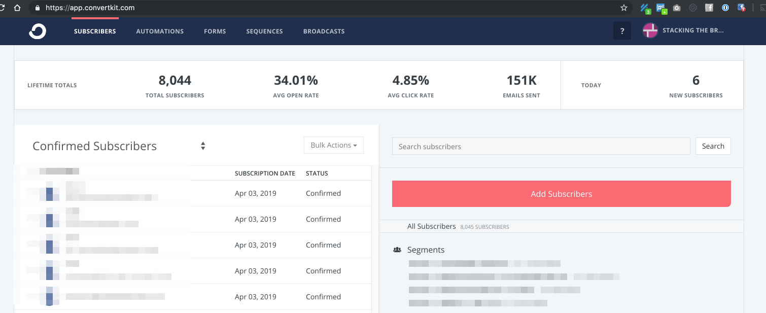
2. CKPro widens the right hand gutter on the subscribers page.
You might notice in the image above that the two-column layout is a bit closer to 50/50 than the standard 70/30 layout CK offers. The reason? Well, we have a lot of tags, but ConvertKit doesn’t have any way to group tags (or hide tags from the master list, which again, is right on the “dashboard”). To keep our tag list organized, I’ve been using naming conventions that make our tag length…unusually long, and even more difficult to scan quickly when tags start to wrap in the narrow right hand gutter. So I widened it.
3. CKPro removes the Visual Automation Previews on the Visual Automations “list” page.
I love CK’s approach to Visual Automations, but these “thumbnails” aren’t helpful for knowing which automation is which.
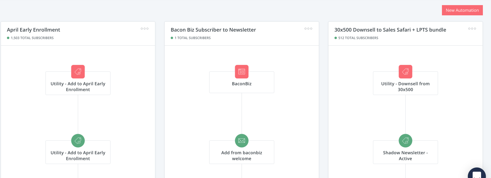
Since these huge preview thumbails take up a lot of screen real estate, and there is no way to filter/sort Visual Automations on this page, my odds of having to scroll past that first row are much, much too high.
CK pro lets you access 15 Automations in the same amount of space as just 3 Automations in the standard design.
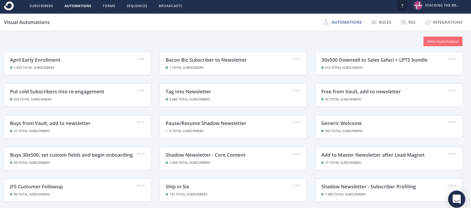
That’s a pretty massive improvement IMHO.
4. CKPro completely reformats the sequences list page into a high-info-density grid.
Similar to the problem on the Automations list page, the default Sequences list page has pretty terrible info-density. The info is much more valuable, so I didn’t want to hide it completely.
Thanks to Dave Ceddia I was able to turn this pixel-wasting set of “cards”…
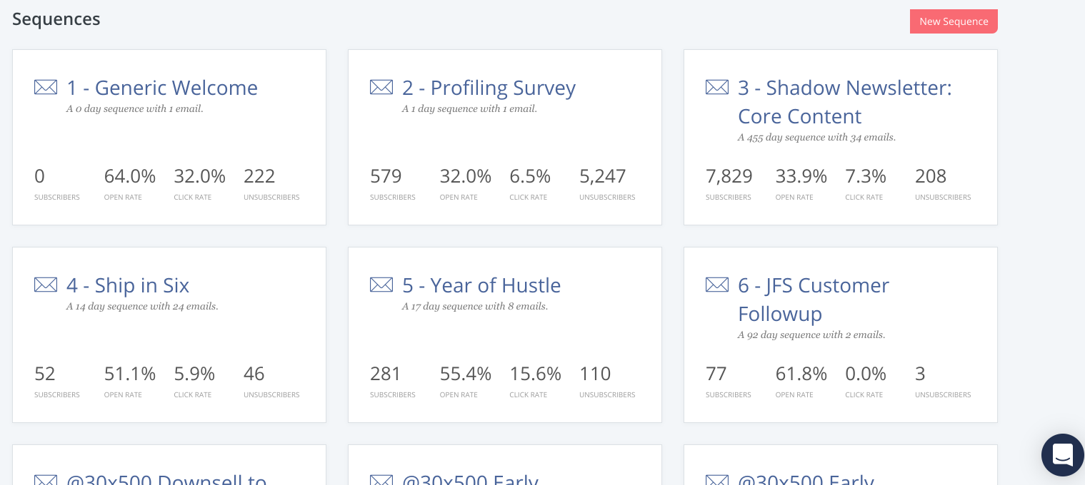
…into this!
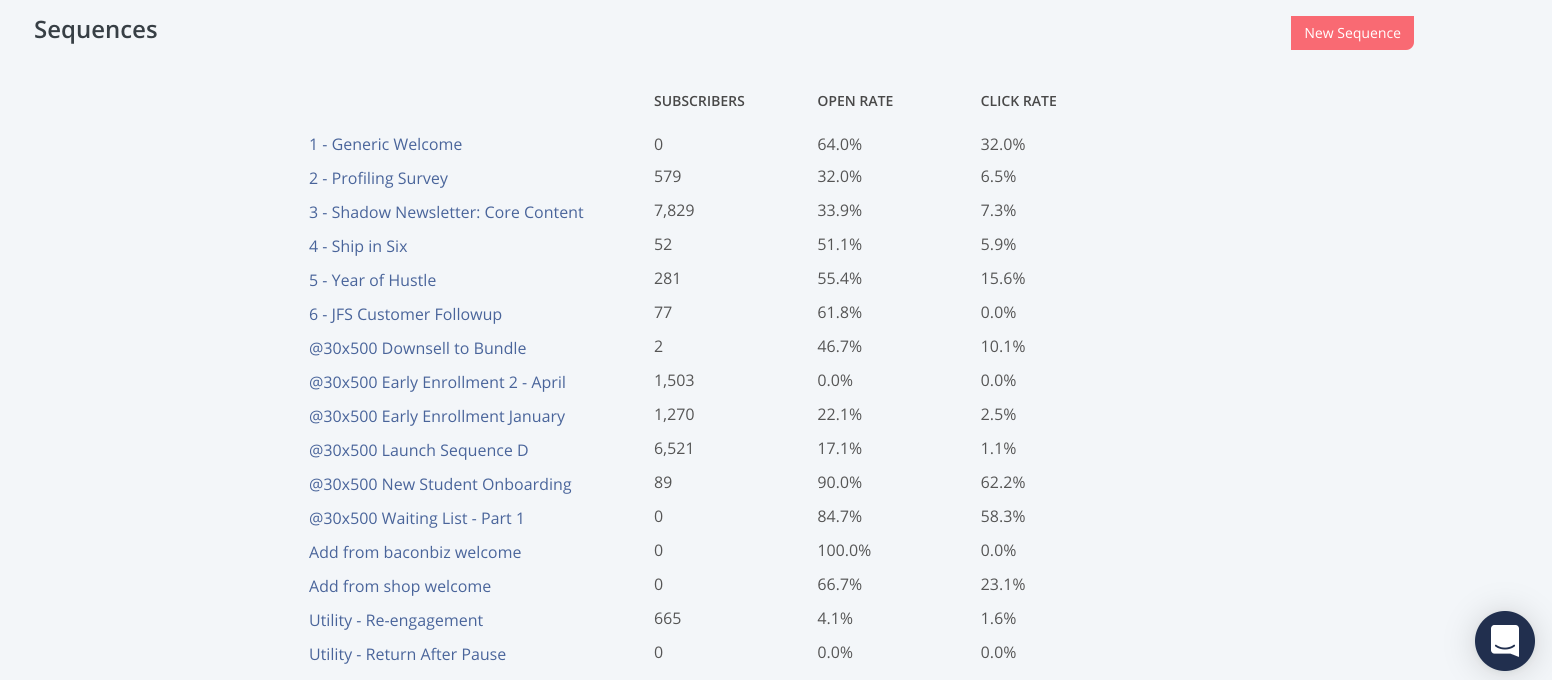
It’s not pretty, but this grid displays more than 3x as many sequences in the same amount of space, and the grid gives all of the stats in an even more useful format for comparison between sequences.
This is hands down my favorite improvement, big thanks to Dave for helping with this one!
If you’re already a ConvertKit user, you can use these CKPro User Styles for free. If you’re new to ConvertKit, or have been looking for a reason to check it out, you can use our link to get signed up.
And if you have ideas for how to make these userstyles better, or nicer looking (without regressing usability, natch), contributions & improvements are welcome!
There's more where that came from
We email every Wednesday with the latest insights from our business, our students, and our research. Drop your email in the box below and we'll send new stuff straight to your inbox!
Absolutely no spam, ever. We respect your email privacy. Unsubscribe anytime. Huzzah!

