So, last time, I told you the grab bag of things we’re doing to get Noko over the Plateau of Doom. Remember, our priorities are:
- Raise prices
- Convert more trials to paid
- Retain more already-paying customers
- Convert more visitors to trials
- Get more visitors
We’ve already raised prices (#1) and implemented several things to get new and old customers to stick around — and we’ll keep working on #2 and #3 forever, probably.
But from the outside, the most obvious change is what we’ve done to further goal #4: to persuade more of our visitors to sign up for a trial, to get them into our real funnel where we can then get them using Noko and then hopefully paying for it (and then sticking around).
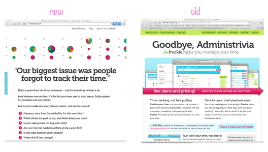
Click to see: New page. Old page (give it time and the images will load).
I burned down our old landing page, scattered the ashes to the wind, and salted the earth.
Why?
Well, it converted badly. Really badly. Embarrassingly badly, actually; our historic conversion rate for the life of the old landing page is way under 1%, and over the summer it’s been a 0.25% or so. Yikes.
Luckily, as you can see, our new landing page has more than doubled our rate so far:
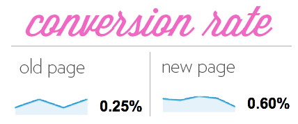
(Does this still look awful? Yes, but that’s not entirely meaningful. That includes visitors who hit nokotime.com and click “Sign In.” And we get a lot of unrelated and junk traffic, and we’ve found most people convert after a 2nd or 3rd visit which affects numbers and is another vector we’re working on. And we’re just getting started on optimizing! This is the magic of DATA!)
But, err…why burn everything down?
“Why not just test some changes for an easy win or two or five?” That’s a good question. Certainly, I could have. Patrick McKenzie, the most generous of internet gentlemen, gave me tons of suggestions that I’m sure would have perked up our CR.
But, in the end, I couldn’t bring myself to polish a turd. I’ve learned so much since I created that page a couple years ago, such as the fact that we were suffering from…
The 9 points of Awfulness
From the design down, that old landing page was fatally flawed in these 5 ways:
- It had multiple columns.
- It had “too-blendy” CTAs (they look harmonious…and don’t stand out!)
- It required too many steps to take in order to try Noko out.
- It had way too much “information”; the content was bald statements, just lying there.
- There was no flow to speak of.
And those were just the superficial issues. Yes, really, superficial…like sentence structure and word choice are superficial when compared to the idea of what you have chosen to write about and why. Design, layout, CTAs — those were not the core of what the page was and why…those were methods used to express the core.
Which, of course, is exactly why they were terrible.
Because there were 4 irreparable problems with the core:
- There was no “room” for the reader to place himself in the scenario…nor a reason he’d want to.
- The idea of who the reader was? Freelancer? Team? Corporate department? Foggy, at best.
- It was a splapdash of “content” and “facts” and “information”; there was no narrative to follow, no “pull” through the content, no drama, no relief, no inevitability of clicking that button.
- The bottom line: Everything focused on the product, not the reader. Features, not pains. Solution only, with the barest hint of what the solution is for. Lots of words, saying very little.
Was it unusually bad?
No, not really. There’s nothing abnormal about our old page. If you compare it to all the other landing pages you see on a daily basis, you’d probably think ours was better than most.
When I sat down to design it, I let my unconscious template of “what a landing page is” set my path. (And I designed it before I wrote it.) Unfortunately, what feels “natural” is so often wrong.
My old page was a narcissist. You can see now why I chose to destroy it instead of repair it.
I took the narcissist out behind the shed.
*Boom!* Our conversions went zoooom to 2.4x the previous rate. I killed the narcissist dead and in its place, and installed a really great listener.
What’s the opposite of narcissism? Empathy, and focusing on others instead of yourself.
Look how we start the new sales copy: “Our biggest issue was people forgot to track their time.”
That’s a direct quote from one of our customers, something we hear all the time in various permutations. We’re not saying what Noko is. It’s not a tagline that describes us. It’s not a joke. It’s not even pretty. Nope. It’s the words straight from our customers’ mouths.
Even if that exact headline phrasing proves, through testing, to be third-rate, working with the words from our customers set the tone, the focus, the core for the rest of the copy as I wrote it:
Let’s talk about you.
Right from the start, we put ourselves in the background in order to answer the important question:
Why should I read this? Because it’s for you, you team-running agency owner you! Why should I read this? Your team doesn’t track their time. That’s a problem. Why should I read this? Your business runs on time. So if your team doesn’t track your time, that’s really bad. OK, smartass, you’re not telling me anything I don’t already know. Why should I read this? Because now you’re intrigued…because everybody loves being the focus of attention, and everybody likes feeling understood the most of all. And we understand you.
And then, we segue into some questions of our own — that they ask themselves, or ought to — in order to pique their curiosity (screencap):
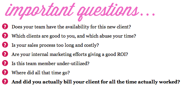
Are we telling them something new? No. Savvy agency owners already know that time is critical, that these questions are important, and that they cannot be answered without an accurate reckoning of their team’s time.
Savvy agency owners know that their team doesn’t want to track their time, for all kinds of reasons (both blameless and not). They know they can either have a low key cold war with their staff about tracking the time — or they sacrifice the biz intel, and muddle through, in order to keep the peace.
None of this is new. None of it is a surprise. We’re not trying to “educate.”
What are we trying to achieve, then?
We lay out a private pain, a struggle that none of their employees would understand, because they don’t wear the Boss Pants. We make our reader — the owner, both of the agency, and its problems — feel so specifically understood…and not alone.
That’s catnip to them. They just wanna rub it all over and roll in it.
So they keep reading.
Did you notice? There’s no product here. No “features.” No “Noko will help you.” No “that’s why we designed…”.
There’s not even the slightest whiff of product yet. Right now we’re not trying to sell them on our product, or even on us. We are selling them, though:
We’re selling them on their own struggles and pains — most of which have become background noise because they have to simply deal day in, day out, and “that’s just life.” Those problems aren’t likely on the forefront of their mind when they hit up our landing page. So we’re bringing them up, summoning them forward.
To use an extraordinarily apt analogy: Ever try to plant a harvest by simply scattering seeds on the earth? It doesn’t work too well. There’s a reason farmers plough — it’s not fun, it’s not easy, but you have to make the earth ready to take the seeds in. You gotta aerate it, loosen it up, so the little bitty seedlings can spread their roots.
Same for making a sale: You have to stir and loosen, to help get your reader ready to contemplate a solution. Otherwise you’ll never get anything to grow, much less harvest a crop.
Next up: the product? Hold it right there!
So you’re working on your own new copy. You led with pain, you tilled that soil. But…then what?
The temptation is to immediately attempt to sell (to harvest the reader’s money!). But any planter knows there’s a step missing:
- Plough the field.
- ???
- Harvest.
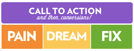
Clearly you’ve got to sow before you can reap. Seeds aren’t a crop — they’re a potential for a crop. In the service of our harvest metaphor, you’ve got to sow the potential of a better reality, in your reader’s mind. You reawaken their pain; then you get them daydreaming of a reality where that pain doesn’t even exist. Then, THEN, and ONLY THEN do you bring up the product.
They’re ready.
But…what I know is how to write about my product. Where’s this other stuff come from??
Where do the pains and dreams come from? They’re not yours — they’ve got to be your readers’. You can’t just make this shit up. You have to truly empathize with them.
How do you know just what they feel and need? To give them that delicious you-understand-me-holy-cow-you-had-me-at-hello catnip experience? To light a fire under their tail to read your entire copy, to surface their pain, to dream, and then to be ready to pull the trigger and try your product?
That question shimmers with the promise of gold… product-design gold, marketing gold, and line-your-pocket gold.
My original sketchy notes for the new landing page looked like this:
PAINS: Your title isn’t “Chief Executive Time Tracker.”
Time tracking is a PITA. Ergo time does not get tracked. Ergo… life blood is dripping away.
Team does great work and resents the intrusion of crappy software. Time wasted time tracking. Don’t know utilization. Don’t know availability / work patterns.
With these notes, and my formula (Pain, Dream, Fix — aka the reader’s pains, the reader’s dream, and then how a product will bridge that gap) — plus a liberal application of microbrew — I fleshed out the details, and was able to write our new landing page copy in its entirety in just one sitting:
- the PAIN of your team not tracking time
- …and the questions it leaves unanswered
- …and the strife caused by trying to get them to track the time…
- the joy (DREAM) of having all the numbers, and answers, you need — and your team is happy, too
- and the way (FIX) you can get that for yourself!
- and wouldn’t you like to try it? (CTA)
Bam!
What if you DON’T KNOW your customer’s pain?
Where did those notes come from, though? How did I spin them into such vivid detail? Where did I get the questions? How do I know there’s tension between the agency boss and the team?
I didn’t just sit down and pull those pain points out of my ass. Nope. I know my customers. You might think that’s because we’ve been running Noko for nearly 5 years, and sure, that helped.
But I’ve known these exact customer pains from day 1 — because those are the pains I designed Noko to kill, in June 2008. This whole process wouldn’t work if Noko wasn’t designed to serve, if I didn’t understand and focus on my customers when I built the product, itself.
All copywriting can do is get people in the door. If you have a crappy product — if you don’t follow through — they’ll leave.
So how on earth do you ensure empathy from the ground up?
Study the wildlife in its native environment
Here’s how you can uncover this kind of intel on your would-be customers:
- Find your audience online (and anywhere else they gather).
- Listen to what they say — and what they don’t say:
What they gripe about; what they invent, innovate, or discover; what they share with each other, what they recommend, their folk wisdoms and assumptions, the books and blogs they read and what they do with them. 3. Analyze your new data. 4. Figure out the opposite of the problems they have. 5. Design a pitch, and a product, around that.
This is what I call Sales Safari — as an important contrast to Sales Zoo, which is when you “study” the wildlife in an artificial environment (e.g. “What is your biggest problem?” vs watching what makes them curse and bitch the most).
I’ve written more about the Sales Safari process specifically here, here and here.
2.4x is not the end, but only the beginning.
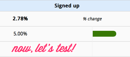
While the increase is very nice, we’re not done. What’s great is that copy that is mostly-right is vastly easier to test than copy that is mostly-wrong. Instead of hunting around in the dark and trying random stuff, you can fine tune:
 Testing button copy
There’s a change in who signs up, too. We’re now signing up at least 2x the amount of larger plans. Larger plans pay more, get more value in return, and they churn a lot less.
I’m not writing this to brag. No, what I really want is to hammer down this really critical point:
Look at what’s possible when you shut up about your product and yourself long enough to focus on your customer. Even for something as dead boring — in a saturated market — as time tracking app. Magical things can happen.
So, in conclusion:
Kill the narcissist, install the listener, and farm like somebody who knows a horse from a hole in the ground
Start with your reader. Focus on them. Sell them on their own pain. Show them how to dream. Then, and only then, talk about the product. Make it inevitable — it’s so clear that the product was designed to kill their pain, and deliver them their dream…it’s the magical sparkly walkway that’ll take them from their shitty reality to a much better one. Yay!
And, then and only then, worry about the design: Cut the columns. Cut all the excess graphics. Cut the feature-speke. Cut the extra pages/steps to choose plans. Cut, cut, cut.
If you focus on the reader at every step, the design will almost take care of itself. And, with guidance & polishing, so will the sales.
How do you make your first sale?
Follow our FREE roadmap from $0 to $10k and start your product business one small, achievable win at a time.
When you subscribe, you’ll also get biz advice, design rants, and stories from the trenches once a week (or so). We respect your email privacy.


