Why don’t people buy? Here’s one big reason: Goldilocks is tired.
Imagine, if you will, a version of the Goldilocks tale where our little miscreant is faced not with three bowls of porridge and three beds to try, but ten. Or twenty. Or thirty. Is she going to try each and every single one?
Or is she going to decide that if crime is going to involve this much work, she might as go straight and get a job?
By now you’ve no doubt heard of The Paradox of Choice, both the book and the idea behind it. Just in case you haven’t, the premise is this: People chafe when you give them no choice. But people get overwhelmed, indecisive, and most importantly, run away with nothing when you give them too much choice.
You could summarize the research that inspired the book as, “I get to choose among twenty-four jams? Wow gosh I guess I just don’t need jam at all.”
It’s hard work to make a decision.
And your customer is usually the one doing the work.
You know, the one you hope will reach into their wallet and pull out a credit card, taking a leap of faith on your product. As if that isn’t enough work to be getting on with.
Yet the endless temptation is to give into anxiety, and “overstuff” the menu of choices we offer our audience and potential customers, thereby committing the customer to more work before the money shot, thus tiring them out, summoning our fears into reality, hamstringing our sales, and leaving our customers unsatisfied 😯
Case in point: I need a new swimsuit.
Like most people, I’d wager, I don’t particularly want to shop for a new swimsuit. (Or anything, really. It’s a mistake to think people are excited to buy your product. Indeed no! They are excited to solve a problem. Or, if it’s a thing they’ve lusted after a long time, they are excited to hold it in their hot little hands. Or, if it’s an auction, they’re excited to win. The act of paying is a best-forgotten means to an end.)
Also: I don’t like swimsuits, they’re uncomfortable and wet fabric makes my skin crawl, so I don’t really know what exactly I’m looking for.
I do know there are things I will never in my life buy (bikini, long-sleeve rash guard, anything with small print, frilly knee-length swim skirts), but… I can’t say that there’s anything I positively like.
And then there’s the enhanced difficulty level: I’ve lost weight and need a smaller size, but seeing as I’ve lost weight, I’m not quite sure what size that is.
So, basically, I am begrudgingly out to exchange money for something I require, to fulfill a purpose, because otherwise I’m gonna end up with the wet-saggy-diaper effect and inadvertently flash my (smaller!) lily white ass the next time I take a dip. Now that’s pain I can easily imagine and would like to avoid.
This — not exuberantly skipping towards sales — is a fairly typical buyer’s scenario.
So who gets my begrudging swimsuit business?
Whoever demands the least of me while offering me the “best fit” product (because there’s no such thing as a perfect product).
Where did I go first?
Well, Lands End had been emailing me about 50% off swimwear specifically so naturally, they were perfectly positioned for my first click. I like saving money. Especially on things I don’t actually want to buy.

But as it turns out, Lands End didn’t want to take my money.
I clicked their big ass sale click-target, and this is what they presented me with:
This isn’t a Bathing Suit… this is a half-naked person.
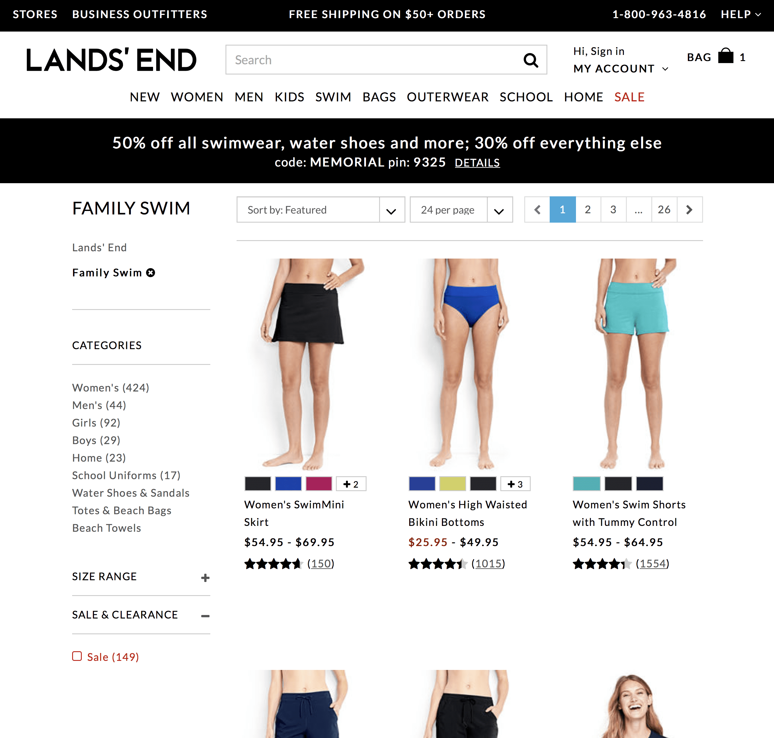
The destination? The Family Swim page. Not a menu of options. Not suits for me, their customer. They know what I’ve ordered, they know I only order for one person (me) and what size I am (plus).
No, they lay out a bunch of products I have no interest in and which do not look like bathing suits, and expect me to hunt for the navigation, and then use the navigation, which involves page reloads and disclosure toggles!
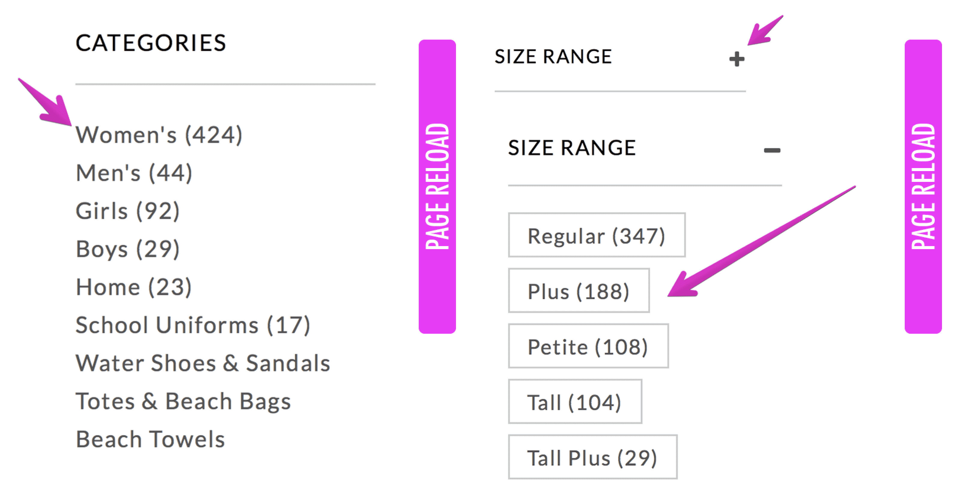
The level of work they demanded me to get to see the damned suits that would fit me? SO OVER THE TOP I’m surprised I didn’t have to meet with HR or pee in a cup.
And! They still didn’t put actual suits up front, just bottoms, and there were SO. MANY. PAGES. Are you not rubbing your forehead just looking at this screenshot?

And! After forcing me to do so much extra work to get to the plus-size suits, they included all the petite and straight size reviews under the items in the plus category, making them less than worthless… a positive review for a small size is actually kind of a warning sign because to work, the cuts have to be different, not just the measurements. A size 2 person may have many things to recommend me but clothing is not one of them.
By the time it came time to click Checkout, I was just thoroughly DONE.
Sure, I added a few things to my cart to try to narrow it down. Then I looked at them, and thought: Will this really do it for me? I looked at so many freaking products and read so many reviews. And tried to puzzle out so many size charts. and I still wasn’t feeling the least bit confident about what I’d “picked,” much less excited.
Screw it. After I had invested probably an hour of my precious time shopping, I walked away from the cart.
Folks, I estimate my working time to be worth $200+ an hour, so I “spent” $200 and didn’t even buy a suit to show for it. Lands End didn’t get a penny from me.
But I still needed a suit, ugh, so I thought back to the suit I wore last summer which wasn’t wholly objectionable and helped solve one of my most painful problems (wet fabric grossssssss) with a fluttery panel of weird gauze like stuff that dried super fast. Insofar as I am capable of liking any suit, I liked that.
Where did I get it? Target. So I hit up Target.com.
The experience was completely different.
Immediately, the navigation took me directly where I wanted to go, without page reloads, without me having to click disclosures to reveal hidden options or look at a bunch of shit that didn’t apply to me.
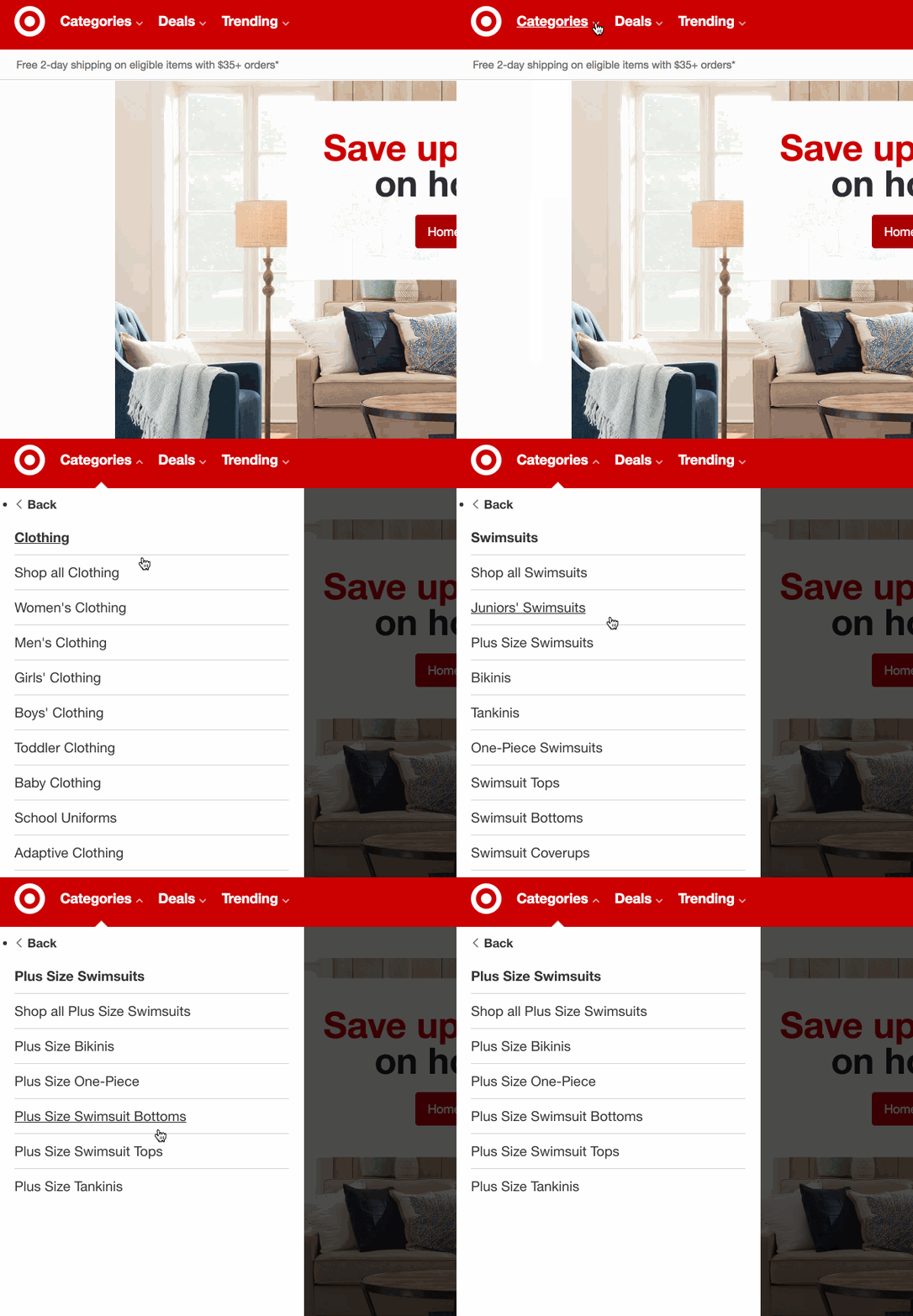
It prompted me up front for a swimsuit type and thus I remembered yeah, I like (“like”) tankinis, because they’re easier to remove (wet fabric is disgusting).
And Target immediately presented me with things that looked like whole swimsuits.
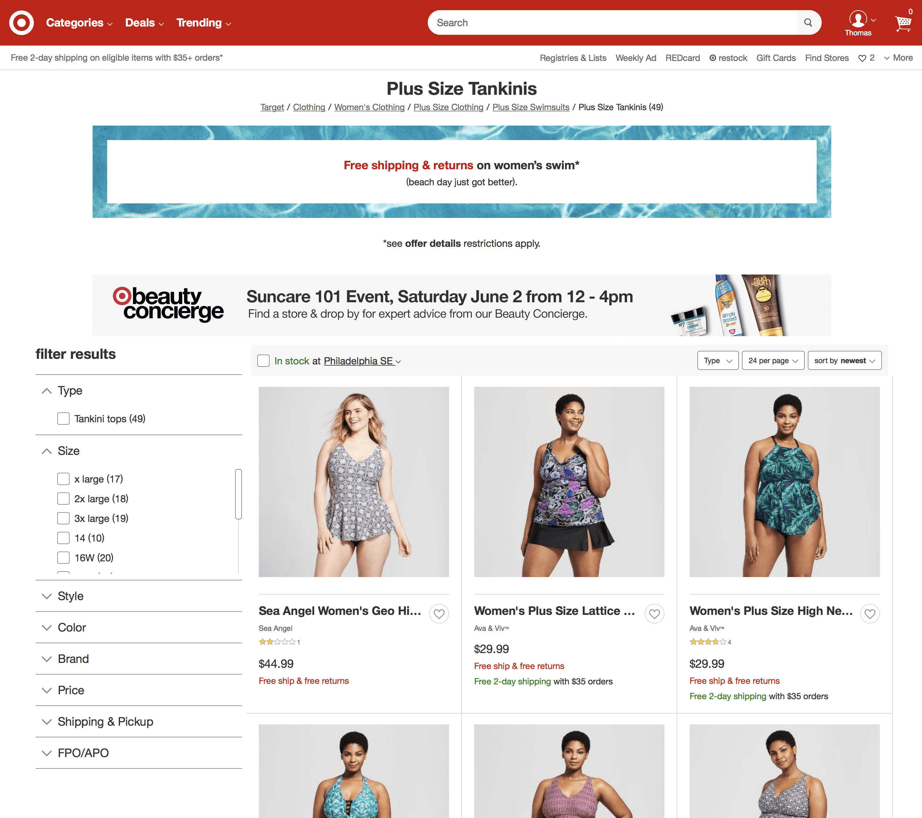
And there were only three pages to make it through.

And each top offered me a choice of bottoms, right on the page, bundled in.
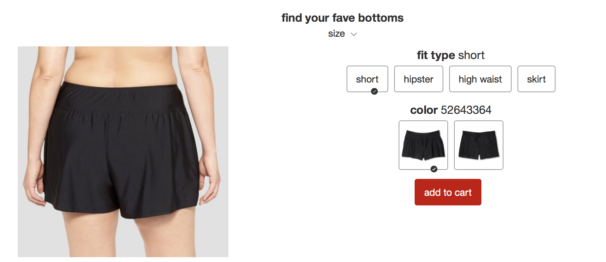
And, get this — the plus-size models were actually plus-size and all the reviews for the plus-size swimsuits are from plus-size buyers. Gasp.
And GET THIS — Target automatically tried to guess the right size based on my last purchase. This wasn’t entirely accurate, but it was helpful! GASP!!
Reader, I bought from the company that let me be both lazy and confident.
Target made it easy:
- they didn’t make me hunt for navigation or wait for page reloads
- they prompted me for what I would like (sorta)
- they took me straight to the suits I would buy
- the initial merchandising showed whole swimsuits, not disembodied parts
- they only showed me reviews that were relevant
- they tried to pre-select my size
- they had fewer items and I immediately found bathing suit components designed to solve my particular problems (mid-section, chafing) which didn’t seem to exist at Lands End (although with all the cruft in their listings, who could tell)
- bonus: I know from experience that it’s easier to return things to Target than Lands End, which makes me way more gung-ho with the Complete Checkout button
Everything Lands End did wrong, Target did right. And for less money.
Lands End had the initial advantage: They got my attention first and managed to soak up an hour of my time. But they did such a terrible job with everything else from merchandising to reviews to navigation, they failed to close the deal. They squandered an immense opportunity. They tried to patch the holes in their sales process with discounts, but even 50% off wasn’t enough.
Target, on the other hand, designed the problem away. Even though, on every objective measure, their site is more cluttered and uglier. I even went to their site directly without an email or an expectation of a discount.
And Target will get my repeat business when I need the next size down… they also make it much easier to go back to your order history than Lands End.
Now that you’ve survived this epic journey with me, here’s your takeaway:
Decision fatigue — and lost sales — is directly attributable to rummage bin thinking.
Ten years ago, I wrote a manifesto about interface design. “Good software is like a good concierge,” I said. That’s still true today. The role of a designer is to anticipate, attend to, and support the needs of the user. In this case, the person who intends to buy something.
When you toss up a grab bag of products, links, nav items, or CTAs on a page and hope something will click with the customer, you’re essentially trying the Bargain Bin approach to merchandising: Toss it all in a box. There’s Something For Everyone!
You hope your customers will dig through and find something they like, because you’re scared they won’t, and you’re anxious that if you cut down the choices, you’ll cut down results.
But the fact is: People aren’t going to rummage. They’re busy. They have competing demands on their time. They’re not feeling confident any of the options will be good. There’s no compelling reason to believe there’s a pony in that pile of shit.
You can’t expect people to pre-pay with their time before they pay with their money.
Your customers want to see something that immediately resonates, This is for me.
People respond best to a small handful of tailored choices presented to them on a silver platter.
That’s why each page should have one Call to Action, and it should be tailored to the content the user chose to read/watch/listen to.
That’s why you should intentionally design content marketing funnels.
That’s why you should have landing pages for specific products and specific audiences.
That’s why you should include vivid details in your headlines and sales copy, screenshots where applicable, copy based on real customers’ words and questions, and real reviews from people who most resemble your customers (crispification: complete!).
That’s why your onboarding should be an experience that trains the software, not a read that trains your customer.
Ideally, you should tailor the experience for each customer.
Here’s how I would design the bathing suit shopping experience:
Cute illustrations to click to pick your shape, pick your size, pick your preferred level of coverage, et voila, here are a handful of curated options! Never again click into something to see your size is sold out or be forced to scroll through scores of products you would never buy!
If somebody offered this to me, swimsuit quality being roughly equal, I’d never buy a swimsuit anywhere else. They’d be guaranteed a new sale pretty much every year. Especially if they asked if I’d like to go up or down a size and let me reorder the same damn thing again.
And if you can’t do a custom picker, create “playlists” of bathing suit types. You could rig it up with links instead of customized software.
Goldilocks is definitely gonna hit that pool.
This design concept applies to a lot of experiences, not just ecommerce.
Here on Stacking the Bricks, many of my “pillar” content pieces have inline CTAs that flow directly from the content and were written at the same time. Others, like Year of Hustle, have their own tailored landing page.
In Noko Time Tracking, we ask our new customers what type of business they’re in, and offer them a tailored set of tags to categorize their time. This makes Noko feel twice as relevant and half as stressful, and takes the sting out of generating their own taxonomy.
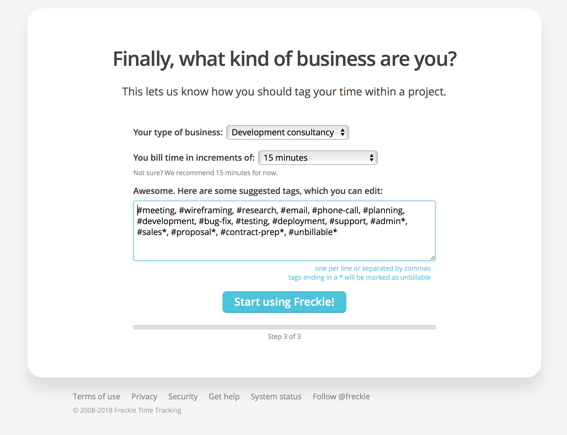
You can still have a large range of products, features, content, links, CTAs, and more without decision fatigue if you simply never show the wrong stuff to the wrong people.
You can do this in your site, your app, your marketing, your launch by carefully considering your customer: where they came from, who they are, where they’re at in the process, what they’ve already bought, what they’ve chosen to read, watch, listen to, or try before.
So your mission, should you choose to accept it, is to go find where you lay all the work on your customer’s shoulders… and figure out how you can lift that burden and act like a 5-star concierge instead.
How do you make your first sale?
Follow our FREE roadmap from $0 to $10k and start your product business one small, achievable win at a time.
When you subscribe, you’ll also get biz advice, design rants, and stories from the trenches once a week (or so). We respect your email privacy.

